
Have you ever used X3’s personalization and used the option on a field to hide it from mobile, only to be left wondering exactly what your page might now look like on a mobile device? Today we’ll look at a tool built for just such a situation, Google Chrome’s built-in mobile emulator.
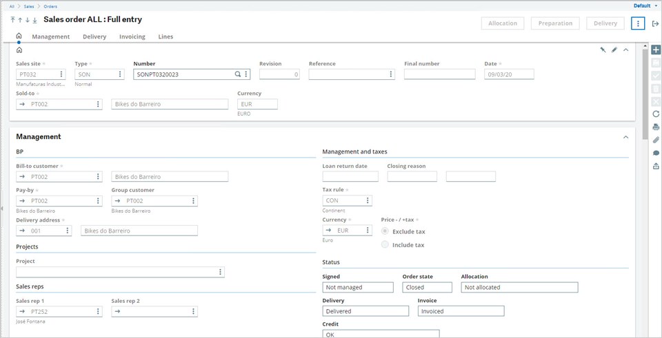
First, let’s go to Sales, Orders, Orders and select the ALL Full Entry transaction to see what our starting point looks like:
Next, we’ll jump into personalization mode to make a few modifications by clicking Default in the top right, then Customize page:

Then we can use the hide on mobile option on a few fields, as seen below:

For this example, I selected the hide on mobile option for three fields under BP; labelled Field, Group customer, and Field:

Based on this selection, we should expect to see a few fields missing from the Management block, but since we’re not on a mobile device there is no change. Let’s Save and name our page, then close out of the personalization.
Now the question is, how can we test our mobile view (other than the obvious answer of browsing to X3 on our mobile device). Maybe we don’t have access to a mobile device or can’t access X3 through a mobile browser due to network limitations. There must be other options, right? Well of course, Chrome DevTools to the rescue!
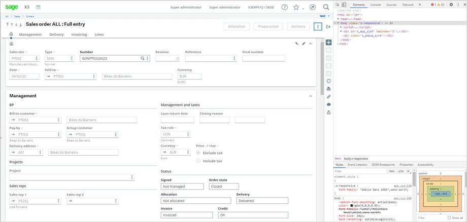
Press F12 while in the Google Chrome browser to bring up the DevTools panel. While I could probably right a whole series of blogs on the tools available here (maybe one day), today we’re just focused on the mobile emulator (known as Toggle device toolbar in the DevTools). Below is our view of our test page with the DevTools open:
And after we click on Toggle device toolbar:
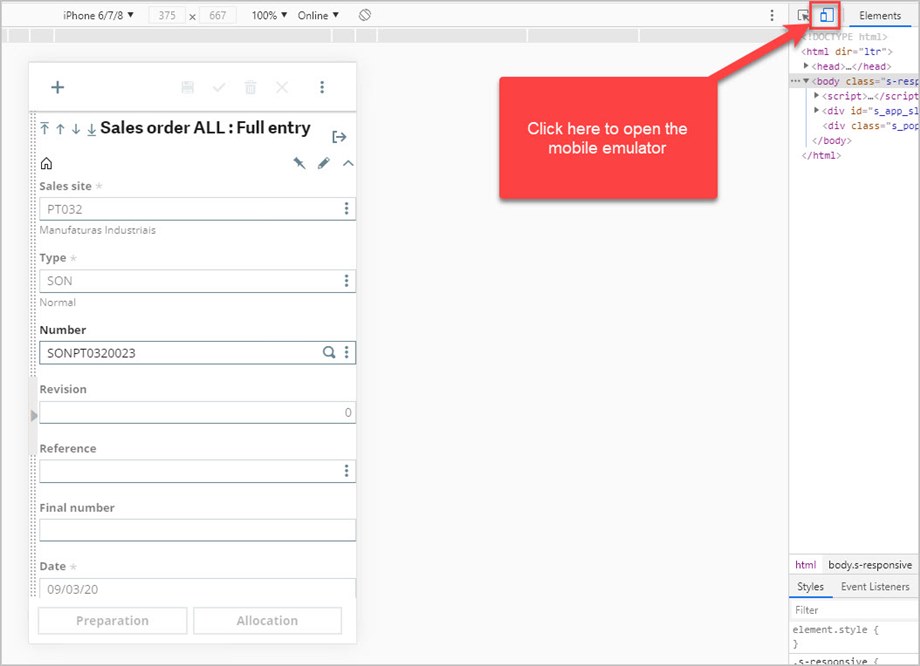
From here we can use the dropdown to emulate the dimensions of various pre-loaded mobile devices, as well as using options to simulate device or network throttling. For more information about the features of mobile emulation, check out Google's DevTools documentation. Scrolling down to the Management block, we can see that the fields we set to be hidden from mobile are nowhere to be found!

There you have it; a quick and easy feature Chrome has built-in to assist with mobile development. Hopefully this saves you some time in the feature if you ever find yourself personalizing pages for viewing on a mobile device. Until next time!