
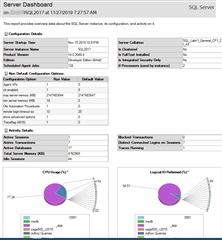
Did you know that SQL Server comes with some helpful built-in reports? I want to talk about one of those reports named the Server Dashboard. This dashboard has a lot of information about SQL Server contained inside "gauges". These "gauges"are similar to how the instrumentation panel looks on your car's dashboard. Each "gauge" contains related information in its own category as you can see below:
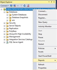
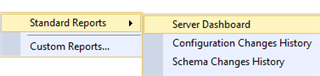
Before I highlight some of the information in some of the gauges, let me show you where you go to launch this dashboard. After you log into SQL Server Management Studio where your X3 database resides, locate Object Explorer usually docked on the left side of SQL Server Management Studio. Locate the name of the SQL Server and right click and select Reports, Standard Reports, Server Dashboard:
Let's look at the top gauge to see what information is there. The server startup time tells us when the server was last started to know how long SQL server has been up and running. You can see the collation sequence for the Server. You can see version number of the product, though I have a hard time remembering that number. I much prefer knowing the Cumulative Update. (CU) or Service Pack(SP). The edition tells us whether its Enterprise Edition, Developer, Business Intelligence Edition etc... Then there is the number of SQL Agent jobs setup to run on a schedule. You can also see the number of processors, 4 in this case being used by the server instance.
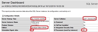
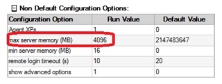
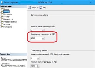
The section under Non Default Configuration Options shows us a few other options including the value set for "maximum server memory. This can also be seen from the server properties screen under the Memory page.
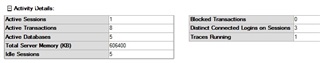
The next section shows current activity stats, showing active sessions, transactions, and databases. Also, the total server memory that's been committed. I wish the total server memory would show in megabytes like in the other gauges so that you would not have to do any conversion. If you notice a number greater than 0 under Blocked Transactions, you should investigate that further which I will cover in a future blog.
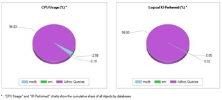
The last gauge is a graphic that shows CPU ad Logical I/O metrics. The data within each pie chart is driven by the database. For example, the CPU usage chart shows which database occupies the most amount of CPU; msdb, EM, Adhoc queries. Note that this metric does not mean that the database the highest percentage is causing performance issues.
I hope you see how easy it is to see this dashboard information at a glance, some which we may ask in Customer Support. If you have used this dashboard, please drop in a comment about it below.
