
When viewing numerical data in Excel, you may at some point want to represent this data visually. This gives you the ability to easily analyze large amounts of data. Charts and graphs also make your report look more professional and can even help when creating dashboards. In this Excel tip, we will show you how to create a simple financial dashboard.
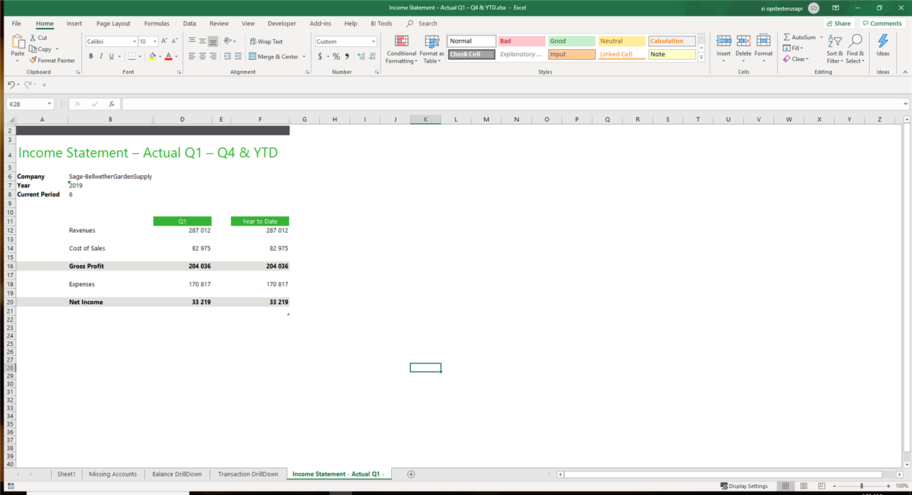
We are going to work with data from a simple income statement. We will create two charts: a waterfall chart and clustered column chart to show the comparison between the different sections of an income statement (revenue, cost of sales, expenses, gross profit and net income
Note: This data can come from anywhere; your Sage solution or from a different Accounting program or even from a simple Excel spreadsheet.
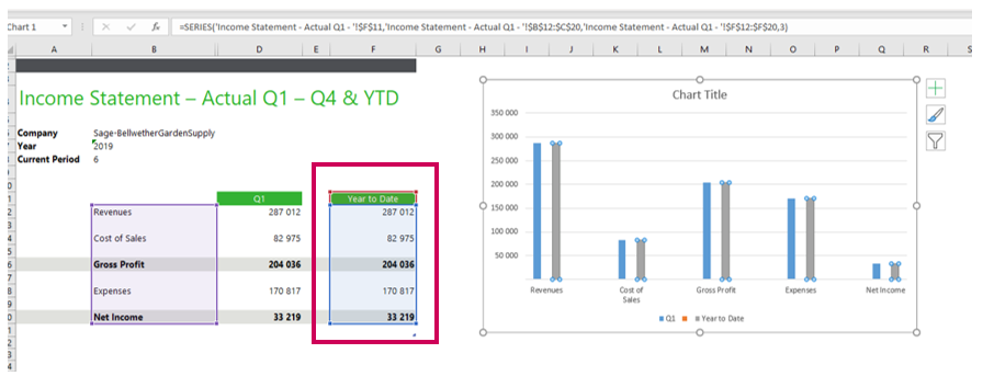
Here we have an income statement showing the revenue, cost of sales, expenses, gross profit and net income for the first quarter as well as the year to date.
Let’s insert two charts to make this report more professional looking and easier to analyze.
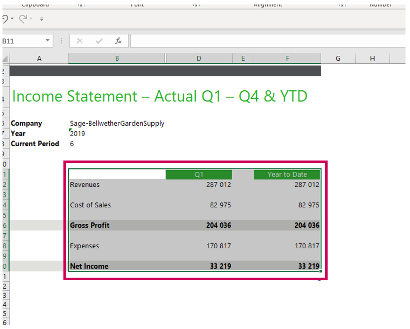
First, you need to select the data you want the charts to represent.
- Make sure the column headings are also highlighted
- Excel will detect data in the selected cells and find a pattern
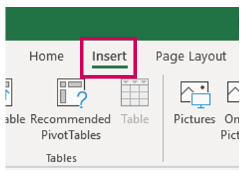
Once you have selected your data, do the following:
- From the main menu in Excel choose Insert
- Go to the Charts section
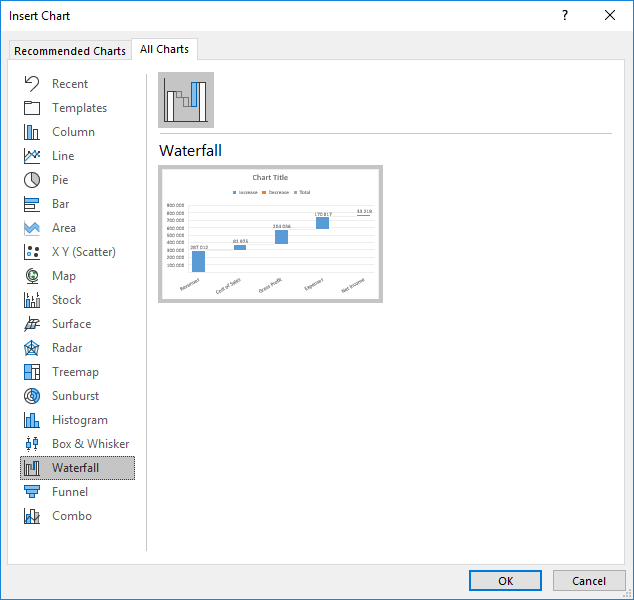
- You should see the chart options. Click on Recommended Charts
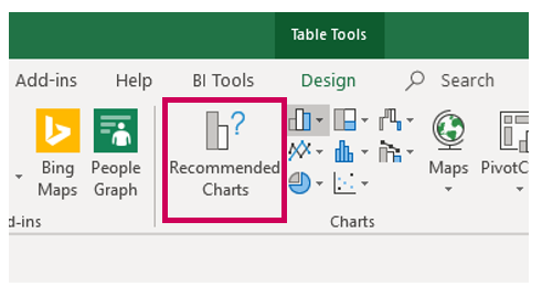
A window appears showing the available chart types:
- Choose the first option to insert a clustered column. Clustered column charts are used to compare values across categories (like between the different sections of an income statement)
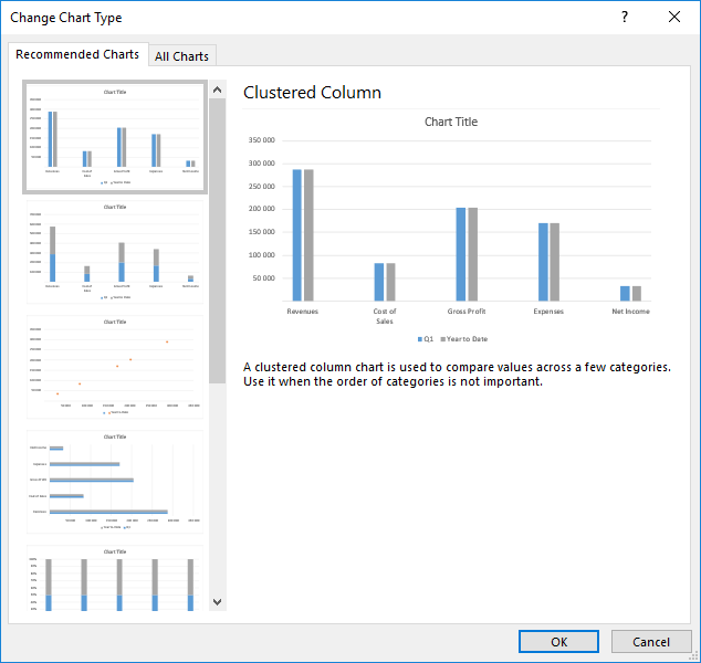
- Click OK
A chart is now inserted in your spreadsheet.
- Click on the chart
- Notice how the data used in the chart is automatically selected and color coded in the income statement. This shows where the chart is pulling its data from.
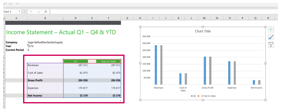
The chart has a legend showing the different areas of data represented. The blue columns represent data for quarter 1 while the grey represents the Year to Date values.
- Click on any of the blue columns. Notice the data selected in the income statement shifts to just the Q1 column and the corresponding income statement categories (Year to Date is no longer part of the selection).
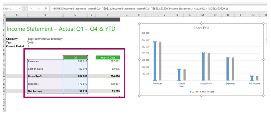
Now click on any of the grey columns. The year to date column of the income statement is now selected (Q1 is no longer part of the selection).
Now, let’s insert a waterfall chart using the same method. These chart types show running totals for each category. They also show increases and decreases (negatives and positives) where available.
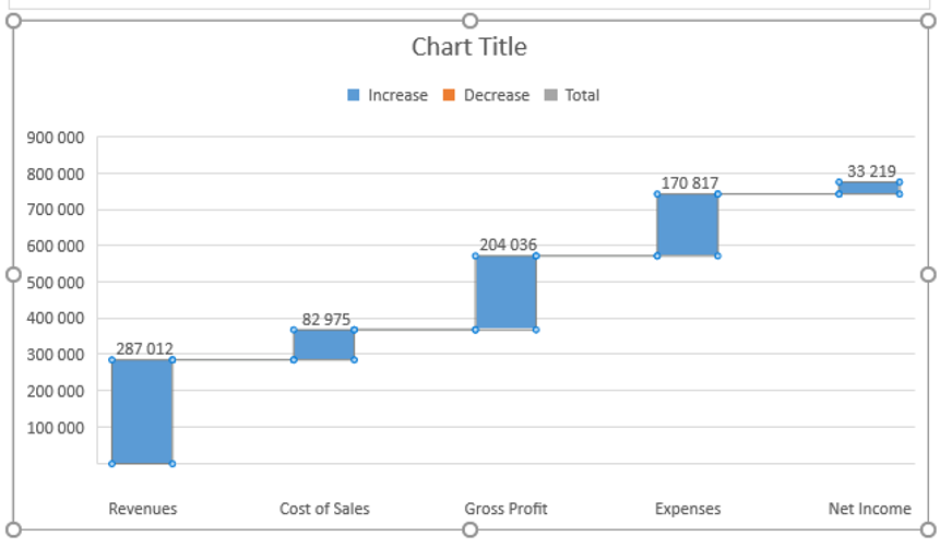
The result should look like the following image:
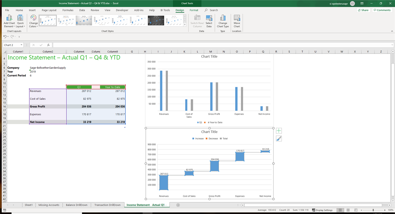
You have now created a simple financial dashboard showing the income statement for Q1 and year to date, with two dynamic charts to assist you when analyzing your financial data.
We also have some parameters (year and period) and if those parameters were to change, the charts will automatically adjust to reflect these changes. No need to recreate the charts!
