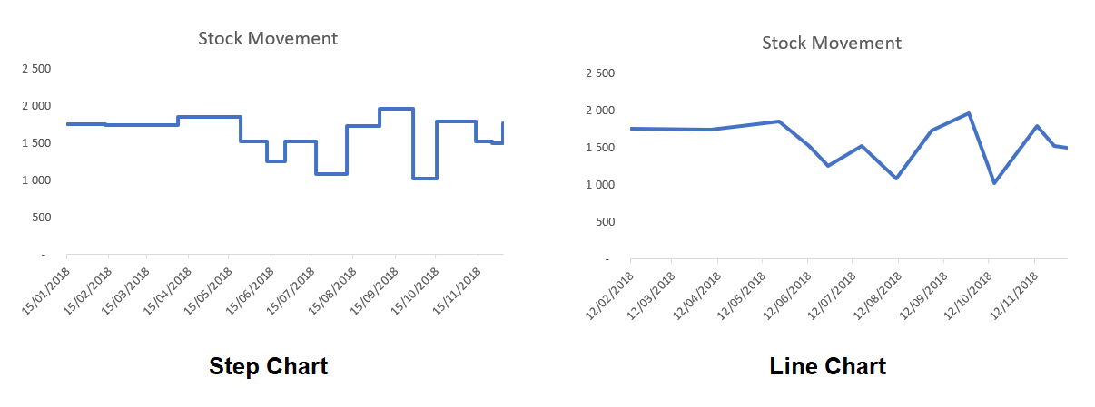
A step chart shows changes that occur over irregular intervals. For example, it can show stock movement changes, interest rates, etc. A step chart is the perfect alternative to a line chart as it displays the trend as well as the time taken between changes.
The difference between a Step Chart and Line Chart: A line chart connects data points and the focus in such charts is the trend and not the exact time of change. On the other hand, a step chart shows the exact time of change in the data as well as the trend. With a step chart, you can easily identify the exact time where there was no change or compare the extent of change at each instance. In this tip, we will show you how to establish the trend of a stock item.
Note: Download the sample workbook to practice this exercise.
Steps to create the Step Chart:
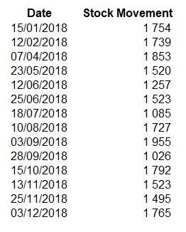
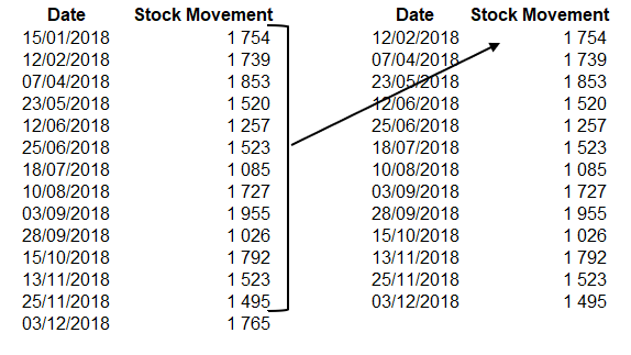
1. The data needs to be reconstructed and set up as follows:
- Copy and paste the headings into new cells.
- From your dataset, copy the dates starting from the second date and paste in the blank "Date" column.
- From your dataset, copy your sales values starting at the first value to the second last value, then paste this in the blank "Stock Movement" column.
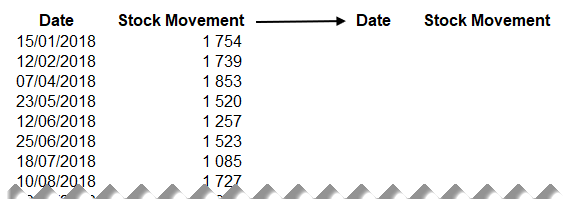
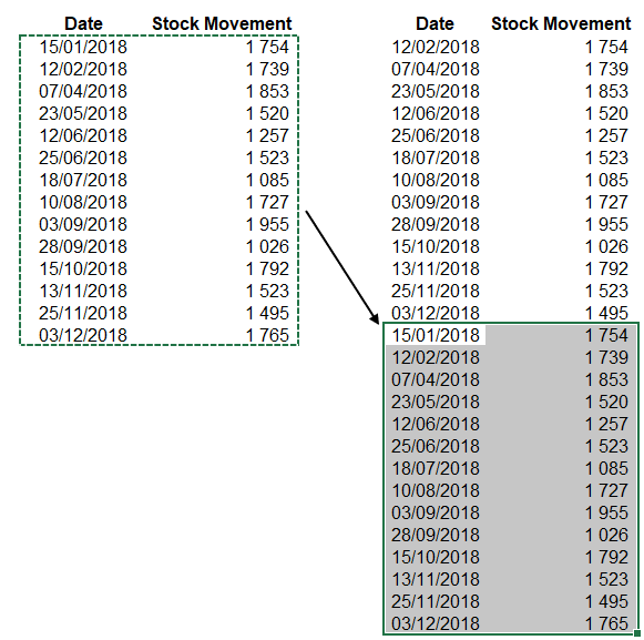
- Copy your original data table and paste it directly underneath the data you have just copied over into your new columns.
2. Using this new dataset, select > Insert > Charts > Line Chart. Your Step Chart has been created and is ready for any formatting required.