

I want to look in this article how the mobile interface is generated.
System Administrators can extend the mobile screens using a feature called RunBlock that covers existing system entities, new custom entities and can include data drawn from external tables.
They can not, however, reference ASP or .NET assemblies within the mobile optimised screens. Neither can they perform process actions such as following a workflow rule or starting a mail merge.
Partners can create a component that includes custom screens and lists that use RunBlock and deliver them to the customer.
The easiest way to explore Mobile Customization is to toggle Device Mode in the Chrome developer tools to emulate a mobile device.

This allows you to
- Emulate the mobile theme across different screen sizes and resolutions, including Retina displays.
- You can see how the Responsive design works and you can visualize and inspect the way in which the CSS is applied.
- You can accurately simulate device input for any customization you are trying to do in Sage CRM.
But how does the Theme works?
Sage CRM stores a list of Devices / Themes and a list of User Agents (browser types) in its metadata. The CRM Administrator can map a User Agent to a Device (but we typically can use the default mappings).
The mobile theme contains an XSL file. This converts the XML generated by CRM mobile into mark-up that the device can render in its native browser. The existing CRM security is retained.
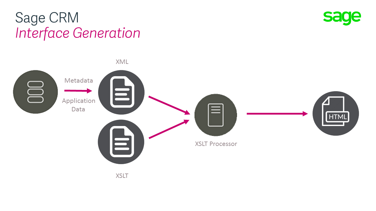
The data and screen definitions associated with the device have to be retrieved from the database. Sage CRM will create an internal XML document that will be transformed into the finished HTML sent to the mobile client using the themes XLST definitions.
We can imagine each screen in the Sage CRM user interface generating a separate XML file to represent that screen and its data.
- Companylist.xml
- CompanySummary.xml
- Findmenu.xml
- Homepage.xml

This is not stored anywhere but is generated on the fly and then depending on the calling device, it is processed by a different XLST file.
And so the interface is generated.
We can start to understand how the screens are generated in practice by logging on using the Chrome emulation.

For the mobile theme, we can see that by examining the generated HTML that this is different from the equivalent screen produced for the standard Desktop interface.
There are different Javascript and CSS files included.
This is all determined by the XSLT file.
The theme has created a simplified interface. And at the same time, it is trying to use the devices ability to Integrate with things like the Phone calling feature.
But again in each screen, a different set of include files, JavaScript and CSS libraries, are loaded into the interface to control its behaviour.
This simplification of the interface and use of different JavaScript files (e.g. Client Side API libraries) means that Client Side coding for the Mobile Theme is very different from the Desktop Theme.