

To follow on from the previous post on personalisation and mobile devices in your email layout, we finish up this mini-blog series on layout by looking at one of the more advanced tools you can use - heatmaps.
Heatmap and Layout:
One of the more advanced tools that companies use to judge the impact of design and layout is heatmapping. This measures how the reader's eye moves over the email and how much time is spent on various parts and content.
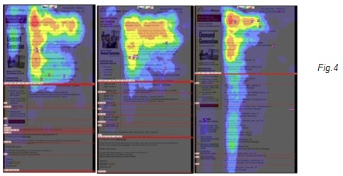
Reader behaviour in general is reflected in this example in Fig.4 below, where the recipient focuses heavily on the top left of the mail, moves from left to right and then scans further down to look for relevant content. The line break indicates the fold - the point at which you have to scroll. You will notice a big drop in the amount of content consumed below the fold.
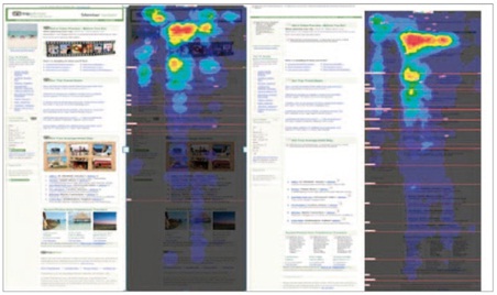
From an image versus text perspective, a well-designed email should still be effective even with image blocking. The below heatmap* compares two emails - one with images intact (left) and the other blocked (right). While the version with the images received more attention, and the reader spent more time on the page, it was not by a significant amount. This was because there was good use of text-oriented design, including tables and alt text to ensure that no context was lost. In the example with the image, the reader spent longer around the image and the headline, but less time scanning through the rest of the mail.
Heatmapping is an advanced tool and not something that most companies will invest in, but it proves the key principles around email layout and design have a scientific basis - you need to have a balanced mix of text and images, and that people do generally consume the content starting from the top left and moving down.
In the next blog, we will take a more detailed look into email marketing content and subject lines.
* Source: 2009 Email Marketing Benchmark Guide, Marketing Sherpa