

To follow on from the previous post on HTML and rendering in your email layout, let's take a look at some other key points around graphic versus text.
Graphic versus Text:
According to Marketing Sherpa* only 33% of those surveyed in 2010 had images turned on by default. So the reality is that the vast majority of recipients will not see your graphics initially. This is why it is essential that you use the right mix of text and image to ensure that your message and call-to-action still make sense, even if your images don't appear.
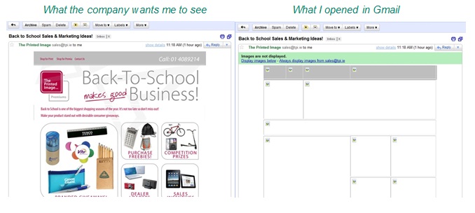
As an example of what is not advisable to do, take a look at the below advertisement from a printing company:
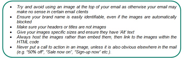
Despite this challenge, images are still important for branding purposes and are proven to have a higher click-through rate**. As a result we have to dramatically re-think the way HTML emails are designed. Here are a few tips:
*Only 33 percent of those surveyed have images in their email provider turned on by default. This is a vast difference from 2006, when the figure was a still concerning 55 percent.- Marketing Sherpa, (2010)
** Mostly image based transactional emails received 50% higher clicks through rates than text based transactional emails. - Silverpop "How Top Retailers Use Transactional Emails" (2007)