New Sage 50 program Icon

SUGGESTED

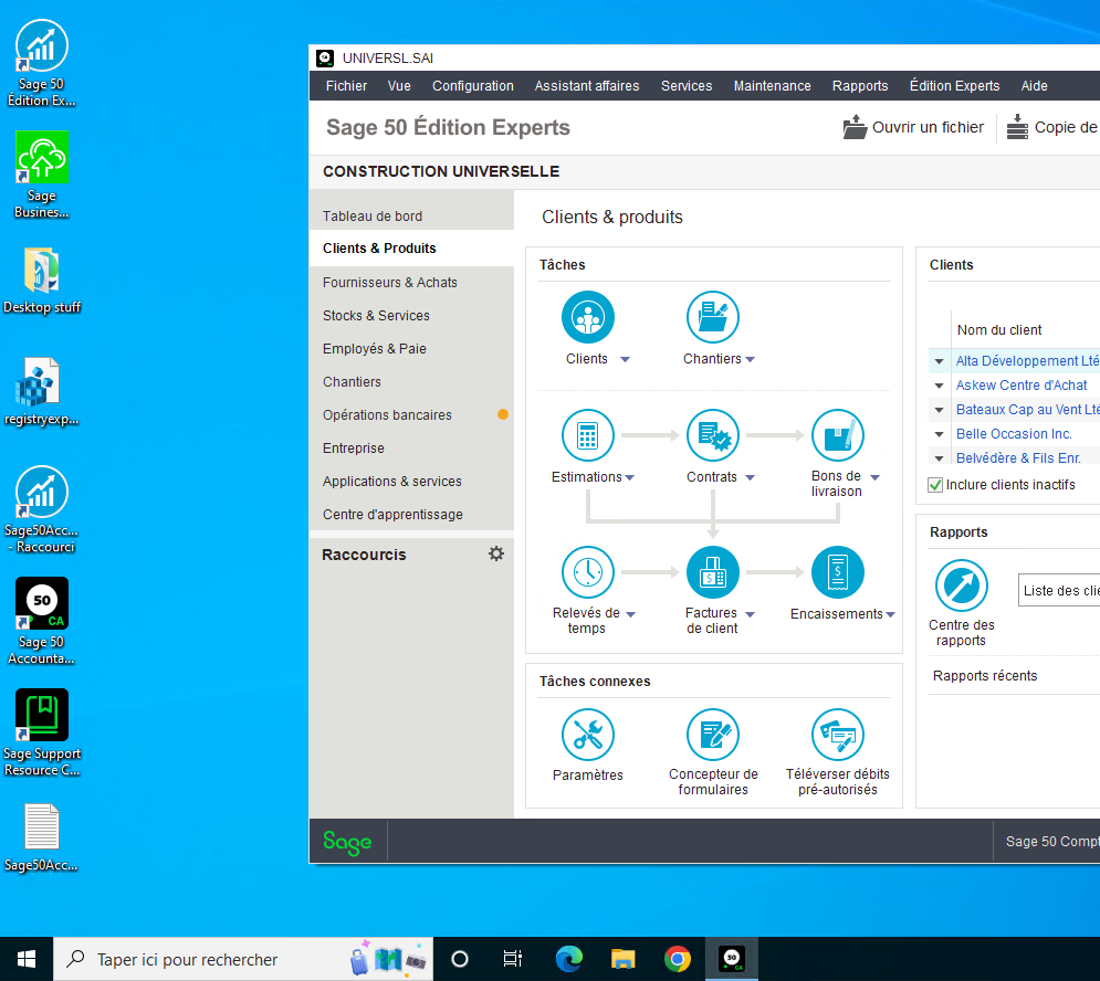
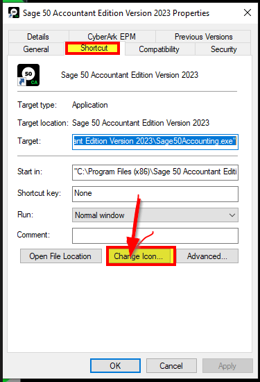
Not sure where else to complain and to bring support to my cause.  The new Sage 50 (2023) icon is horrible.  Windows uses a black task bar, why would any company use a black icon with a white dot as their program icon.  At quick glance I can't find the icon, now I actually have to look for the icon.  Maybe it will grow on me, but it just seems odd to make a black icon for a black taskbar.

Who agrees?

  • 0

    I think you can change your windows colour scheme, but I couldn't agree more!  Whoever was in charge of advertising/marketing and logo design should have been taken off the project.  Its not eye catching at all.  Makes NO SENSE AT ALL.  To go from the nice colour they had to this, is just awful.  They could have kept with the same colour and just revamped the design.  It looks cheap.

  • 0
    SUGGESTED

    Hi Mike-NS, 

    Thank you for the feedback. The branding change is unfortunate in the case of Windows users with a black taskbar. This change was done to be in line with the rest of our branding.


    If you do need to change the icon, you can replace the image used.

    Follow the steps below:
    1. Right-click the shortcut icon in your desktop.
    2. Select “Properties” from the dropdown menu.
    3. Click on “Shortcut,” then “Change Icon.”
    4. Choose the preferred icon from suggested or upload your own.
    5. Click on “Ok” to confirm and exit the settings menu.

    Hope this helps!

    Warm Regards, 
    Erzsi

  • 0 in reply to Erzsi_I

    Erzsi,

    Thank you for the quick response although it is a little short-sighted (along with Sage).  It would be interesting to know what percentage of Sage users still use Windows as their main platform.  That being said, if Sage actually had any previous insight into this problem, they would have included the previous version(s) Sage 50 icons in with the current executable.

    I will probably just use an SAP or Quickbooks icon out of spite until Sage includes a better Windows platform icon in their executable.

  • 0 in reply to Mike-NS

    I like the icon in black, it shows up great on my white background on the task bar. 

    We will never get everyone to agree on what colour any icon should be as there are so many variables. When a company is designing for their logo, the colour of a task bar should be very low on their criteria as the task bars can be changed to suit each individual.

  • 0

    I agree. looks like a pool ball...maybe a little more time on getting the program working properly and less time on the "frills"

  • 0 in reply to Karolin

    Still waiting for 20 years now or so for them to fix the "across year ends" ability to create a single report for a given GL account. Don't expect it any time soon, but at least they got the passwords over 7 characters....

    Sage is possibly the slowest and most incompetent company to have taken over this product. Unfortunate for us who have been using it in our practices forever. 

    Still the best of a bad lot on the desktop with Sage 50cloud hybrid. But the bar is low.

  • 0 in reply to donhobs

    Hi ,

    Although we do our best to help where possible and work to ensure that software is operational on supported systems; the list for requested features is long. You can request that this be addressed in a future update, via the Sage City Ideation page for Sage 50 CA reporting here.

    Perhaps this posted idea in particular is one to up vote.

    Warm Regards, 
    Erzsi

  • 0 in reply to Erzsi_I

    With respect, you must be new here....this has been on the "ask" list for almost two decades and dates back to the Bedford, ACCPAC and Computer Associates days, continuing into the SAGE era. (Along, FWIW, with the password issue, now resolved.)

    Please permit me a small rant:

    Most of the problem is that Sage (and prior owners of the Canadian verions) keep changing lists, portals and access and the items get lost, dropped, forgotten or ignored. And the desktop version (now thankfully "hybridized") has been the most ignored of all.

    The lack of uptake of the web version is I imagine, the only reason changes are now - finally - being made to this version. Those of us who have been using this product for a long time are also equally long-suffering, putting up with it because it is still the fastest, most reliable high-speed data-entry accounting program for small businesses around. And until now it used Debits and Credits (although as we now see it's "money in" and "money out" which is insulting to every professional user).

    The current product is functionally almost identical to Simply Accounting v8 (IIRC), except for the database construction (~2002-2003).

    /end rant

    Just an FYI. Some of us have been using this product since its inception in 1981. I am one of those and know plenty of others.

  • 0

    I totally agree, which is how I found this comment. It's just a black square, with a white circle - the 50 can't be seen on the task bar.