
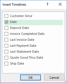
- Timelines only work with date type information.
- You can only use them in a dataset (like a Pivot Table).
- They detect multiple date types from which you can choose one or many (choosing many will produce multiple timelines at once).
- These are available from Excel 2013 and up.
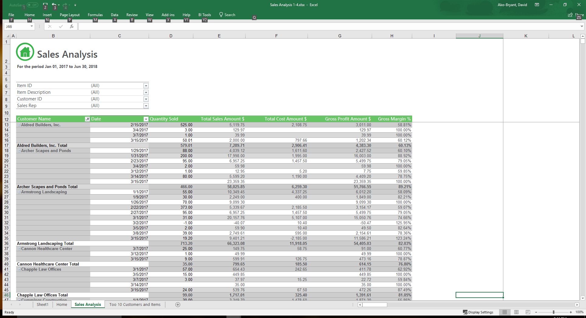
Let's focus on the Date column for a moment. All the values we see here are within the range specified at the top of the report. The report looks good for now—but not so fast; we can make it better. What if we wanted to view sales for just the month of January? We would normally have to apply a filter (in the date column) and choose a date range from Jan 1 to Jan 31. Now what about February? March? We would have to apply the filters once more each time for each month—removing each prior filter before applying the next. Now let's expand that to include, say, just the first week of April or maybe the last three months of 2017. You can see how this can be very time consuming and cumbersome. But remember how we mentioned having you covered? Well, we do, and here's how: This is where the TimeLine feature plays in nicely. By simply applying a timeline to the Pivot Table, we can generate an add in that lets us scroll through whichever time frame we want to look at, seamlessly facilitating our data analysis. To do this, just click anywhere on the Pivot Table, and from the main menu in Excel, choose Insert.

Now, scroll to the Filters section, and choose Timeline.

Timelines only work on date variables, and if more than one date type is detected, all of them will be available for you to choose from. In this case we will just choose Date and click OK.
A timeline now appears based on the entire date range (January 2017 - June 2018) available.

It may not seem like much now, but wait until you see what it can do. Now that we have a timeline, we can quickly look at the sales data for, say, the month of January. All we need to do is click on the bar corresponding to the month of January 2017 and voila, the table effortlessly pivots to display the sales information for just that month in 2017 (we could also choose March, 2018 for example if available).

Notice how all the dates now fall within January 2017?

We can do this for all months within the original time range. But wait... there's more. You are not limited to just pivoting through months of data. Timelines can be adjusted to display dates on a yearly, monthly, quarterly and daily scale. At the top right-hand corner of the timeline, just click the dropdown list and choose your desired option.

In this example, we will choose the DAYS option and choose to display the first 10 days of February 2017.

Again, notice how the dates displayed now fall within the first 10 days of February 2017. And so on, and so forth... We could have applied a filter to filter out the dates, but this would take up so much time. And we would have to remove the old filters to place new ones to get the new results if needed (again, more time consuming). So, the timeline has cut our workload down to just a few button-clicks. So, there you have it—use the timeline feature when working with date values in your pivot table to give your reports a more detailed analysis and to cut your time analysing this information to a fraction of what it originally took to produce the same results when applying regular column filters.